A New Design Language for Third Space Indy
Intro
If you haven’t been following along on social media, you will not have seen the news that there is a new Third Space Indy logo. I developed this logo with my own two hands and the input of anyone who would give it to me. It was truly a community effort, even if that community is small.
A special shout-out to a couple of designer friends I have, including Jeffery Tompkins, Khaled Khlifi, and Alyssa Klein-Kracht, for their guidance. They didn’t offer any designs specifically, but offered comments in ways that helped shape my thinking.
Khaled specifically took the time to write a short document on the designs I was sending him. Unfortunately for him, I did move faster on iterating than his design notes and busy self had time for. I appreciate the concepts shared nonetheless. In this short blog, I’m going to share a bit about how I got to the final product with some examples along the way. Read along if you’re interested!
Third Space Indy is supported by Arrows.
Did you know I write this type of blog for every episode of Third Space Indy? Share your email with me and get the blog, show notes, and links to listen every Monday!
Out With the Old
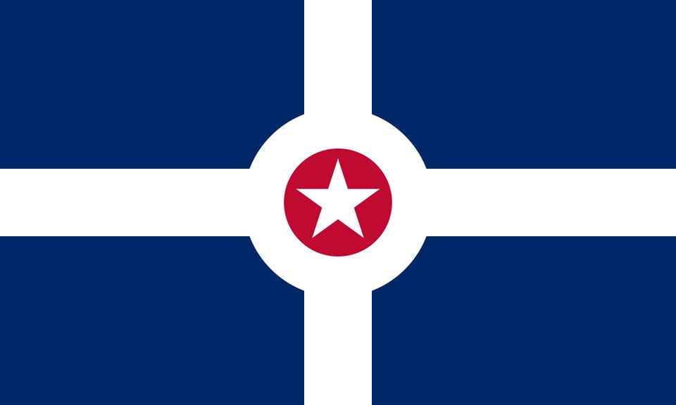
Let’s talk about the old logo, my personal issues with it, and what I wanted to change. Here it is.
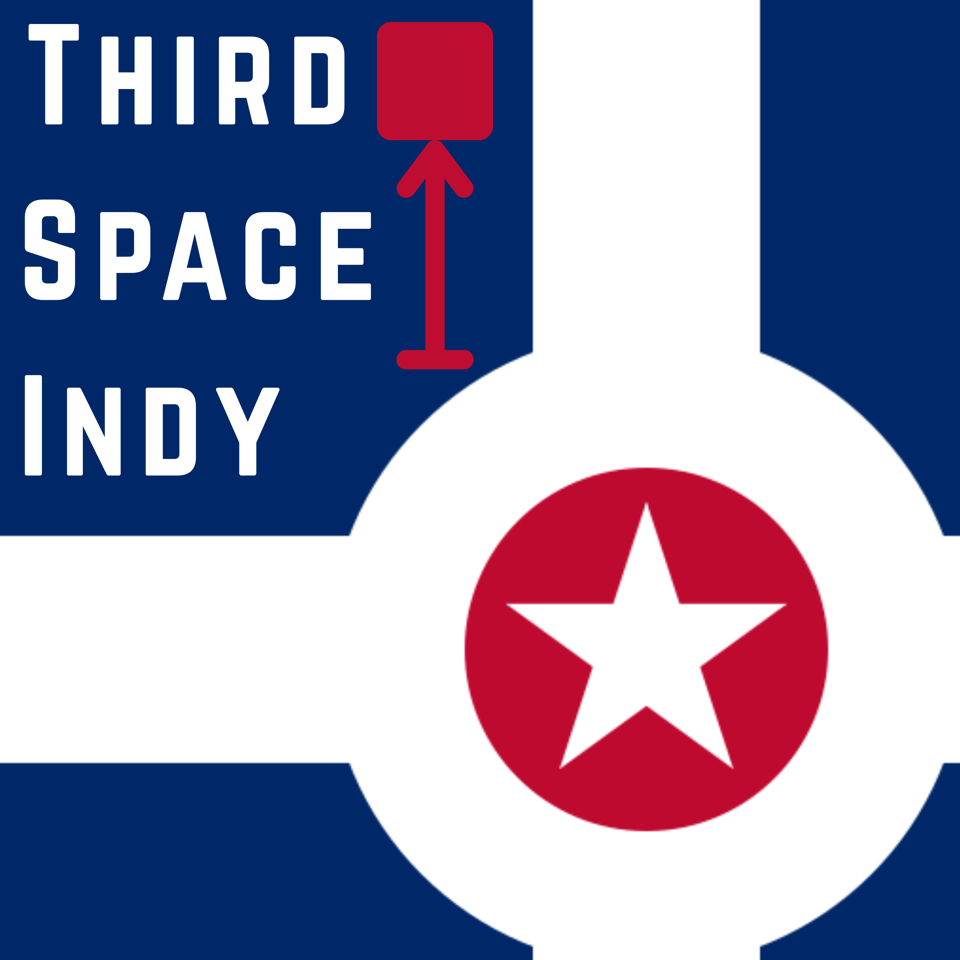
Looking at this again, I actually don’t mind it quite as much as I previously thought. All things considered, I actually think it kind of looks like a podcast logo from around 2015 or 2016, but maybe that’s because I’m used to it.
If you’re familiar with Indianapolis, it’s immediately clear that the logo contains the city flag shifted down and to the right. The words “Third Space Indy” sit in about a ‘third’ of the overall image. And the red arrow pointing to a square represents somewhere off the beaten path in Indianapolis - a space. The red arrow and box also kind of loosely look like a person and a microphone, not really intended, but I’m not mad about it.
No likey
What I hate most is, truthfully and honestly, the colors. They are too harsh on the eyes. Because I’m using an existing flag, I went with the colors of that flag. The lowest lift. But getting the podcast off the ground was far more important than thinking about colors in the beginning. Beyond this, the balance is a bit off, the logo does not fit well into the “profile picture” circle, and I want to differentiate myself just a bit more.
First Steps
Color Time!
Like I mentioned above, the most important thing for me was having more pleasant colors. So this is actually what I did first. Here are the colors I selected.
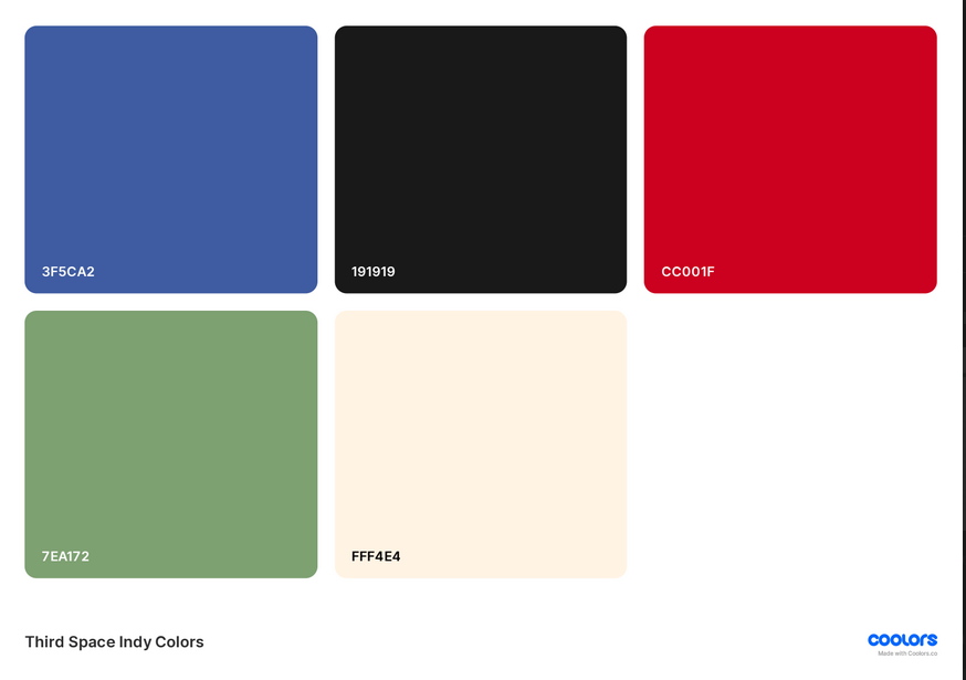
There is a lovely website called coolors.co/ that is a color palette selection site. It offers a selection of colors, and you can lock them while continually cycling, looking for new selections.
I knew I wanted Red, White, and Blue, not only because I wanted to incorporate the Indianapolis flag colors, but I also feel reclaiming the American flag as a positive icon is the most patriotic thing you can do. I love America, and just like Indianapolis, it can do better.
The green was selected to represent green space and nature as a balance to the blue, which can represent water as well. Lastly, the dark dark grey (not black) was selected as a foil to the cream to offer contrast where necessary. All the colors were chosen to be softer and more inviting than the harsher colors of the existing Indianapolis flag.
Visual Influences and Icons
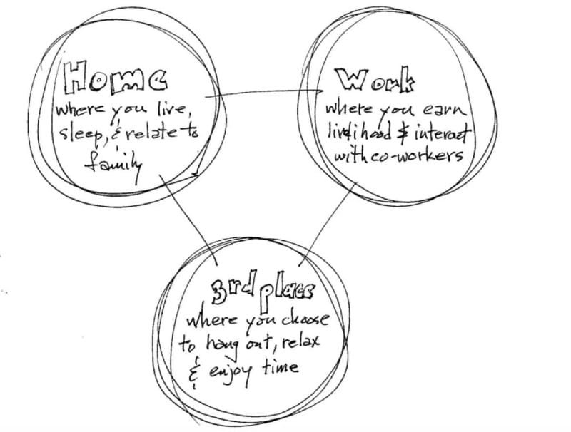
The next thing I did was establish what I wanted to use as influences for the end product. Realistically, I should have selected more, but this diagram explaining what a third space is and the Indianapolis flag were what I was primarily interested in.
I also struggled to think of an iconic representation of the ethereal concept of a third space. So starting small and working my way up seemed smart. I kind of expected the first attempt to be bad, but you never know.
Logo Attempt One
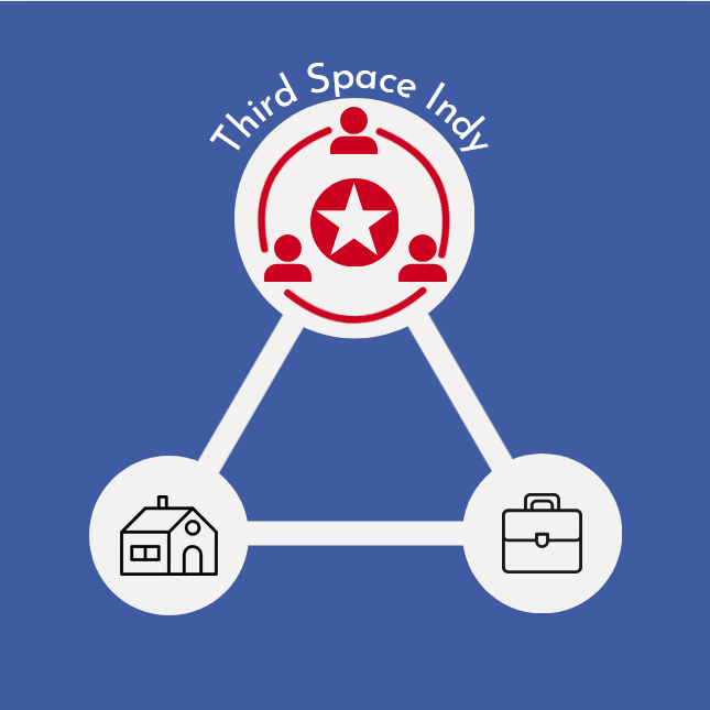
So here it is. Pièce de résistance, the Third Space Indy Logo. You may recognize this from the “What is a Third Space” post I made on Instagram. I am not a graphic designer, and I think that’s obvious from this image here. But I still find it quite charming… mostly because if you look closely at the top circle, it kind of looks like a smiley face.
I am using Canva to make these images rather than Photoshop or Illustrator because I can’t afford paid options right now, so I use the tools at my disposal. This obviously comes through with the goofy house and work icons I used above. I’m glad people told me this was not going to be it, because in retrospect, it’s definitely not.
A Note on AI
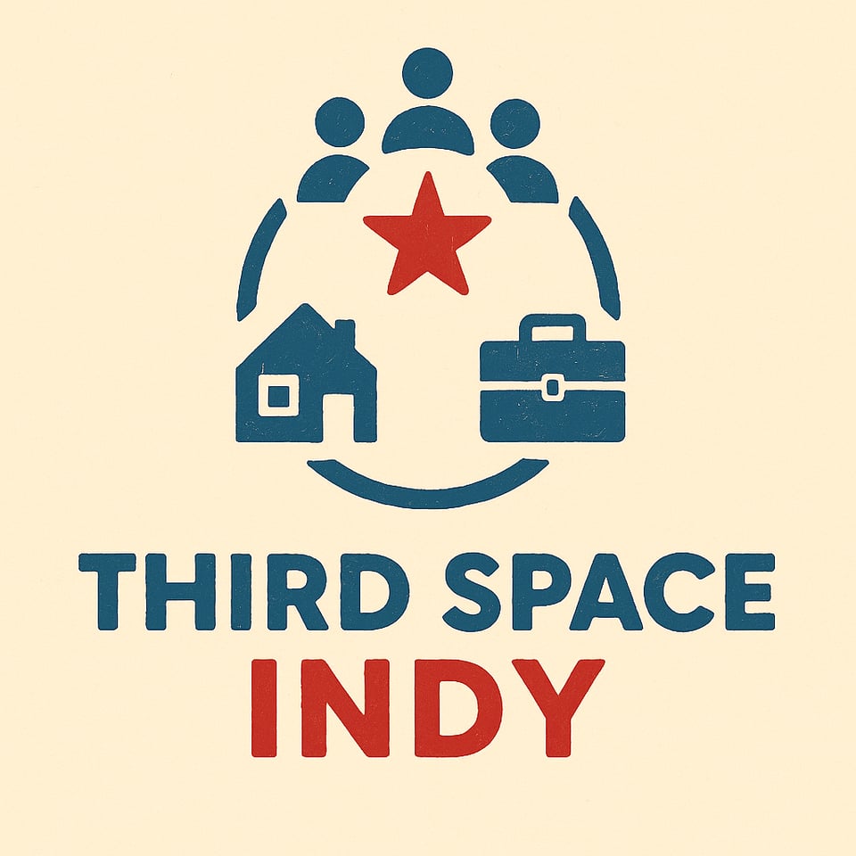
When seeking assistance for the logo, it was often said or offered to use AI. The above image is an example shared with me when I never asked for this type of help. This is frustrating to me for multiple reasons. The two I’d like to say are that when I ask a person for help, I’m asking them because I’m interested in their opinion. I’m interested in their perspective and thoughts. I have access to ChatGPT, Google, and many other tools, but the person is who I’m asking. More than any other reason, though, the use of AI to solve this type of problem is antithetical to the message of Third Space Indy.
I’m not going to pretend I don’t utilize AI. Descript, the software I use to edit the pod, uses AI to transcribe the audio and can help give show notes, among other functions. Primarily, I use this and other tools to save time that can only be spent on solo, busy, non-creative work.
I don’t use any of the generative AI tools it provides because that is in direct conflict with my belief that AI is quite literally removing the human element, making us more isolated.
Additionally, AI generates a particular style of image, is limited in scope of thought, especially when using keywords like “community” because of how it “thinks,” and I just like the idea of solving the visual puzzle with other people, activating the neurons.
If you ask AI what an iconic representation is, it often veers towards something like a handshake. Not only was this icon too generic for what I wanted, but it also feels transactional — something I want to avoid.
Logo Two, Signaroo
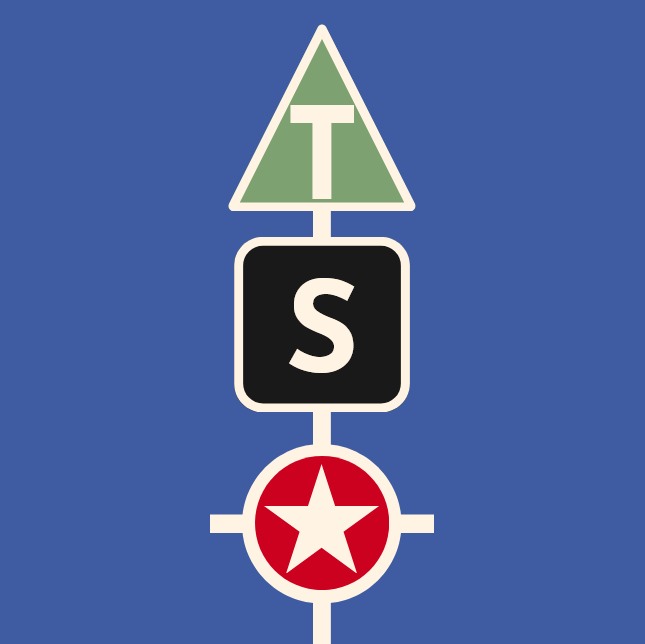
So I moved to simplify the design. You can see what that looks like here. The main inspiration for this iteration was NPR’s current logo. In fact, I even used two squares with the circle in the first iteration of this logo. That was a bit too spot on. But I do like the “talk show” aspect in the inspiration of the logo.

They were stacked differently, and there was also originally no outline on any of the shapes. The suggestion to add an outline came from Jeffery Tompkins, and it was a great idea that made it look more pleasing, I think. At this time, I was trying to simplify too much. But let me share with you some of the fun things that came out of this.
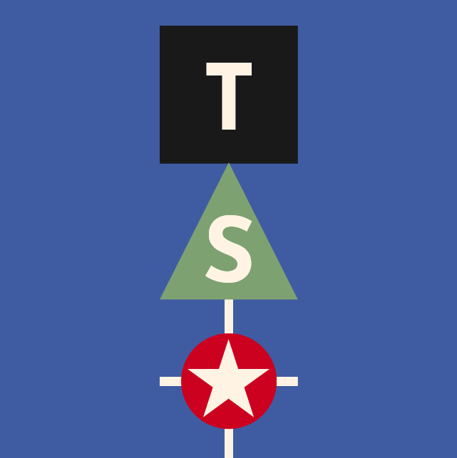
First of all, I love the more abstract iconic representation of place. The green triangle is sharp and pointy, dangerous, like your job, and green like money. The square is dark and boxy like your house, where you rest. And of course, the circle reminds me of a ball, and it’s there to represent Indy — the everywhere else — the play part of third spaces and community.
On the topic of shape, the three shapes reminded me of children’s blocks, which also imply play to an extent. Another aspect of this I enjoyed, definitely!
By adding the outline and putting the triangle on the top, this immediately unlocked a couple of things for me. What is immediately apparent is that it looks like a street sign, which I LOVE. The other thing is that with the rounded edges, it gives a sense of movement and of streets, which almost evokes this top-down view of a city map. Then, by putting the triangle on top, it looks like an arrow. This gives push to the concept of forward progress which I also like.
External Feedback
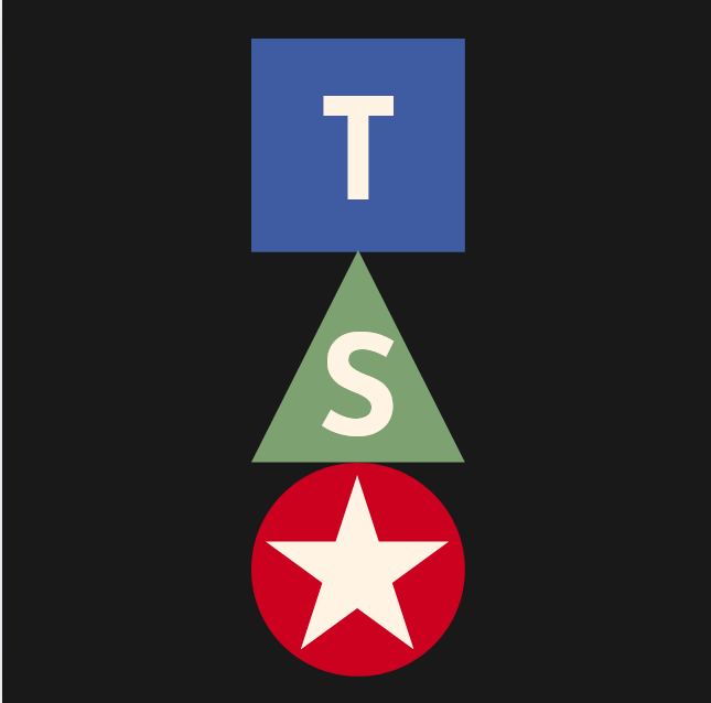
I was pretty happy with this; it seemed like something I could wear on a hat or use for a sticker, but the issues became apparent pretty quickly. The most common point of feedback I received is that this logo, which I’ll post again, reads like TSA, primarily because of the star.
So we moved to attempt to solve this with just a quick text swap. I actually like this all right, but what I love about the ‘T’ is that it kind of continues that road motif and creates a splitting path. But overall, I think it was obvious that it wasn’t working. Because “third spaces” and “community” are so abstract, I think it had to be even more in your face.
A Quick Aside About Weekly Marketing
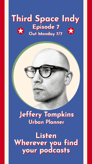
As of episode 7, I decided I am going to start posting “promo” images for my guests. I think it’s a great way to build buzz, as little as there currently is, and just a good way to introduce the person I got to spend time with.
Because of the colors I selected, there is a certain very patriotic angle here. I also consider myself annoyingly political, though more so outside of the podcast. I didn’t really land on this with intention, but the promo template I have now certainly gives off a prohibition era political poster vibe, which I think is fun and overall quite like. Definitely share any feedback you have about it!
The Most Walkable Neighborhood in America
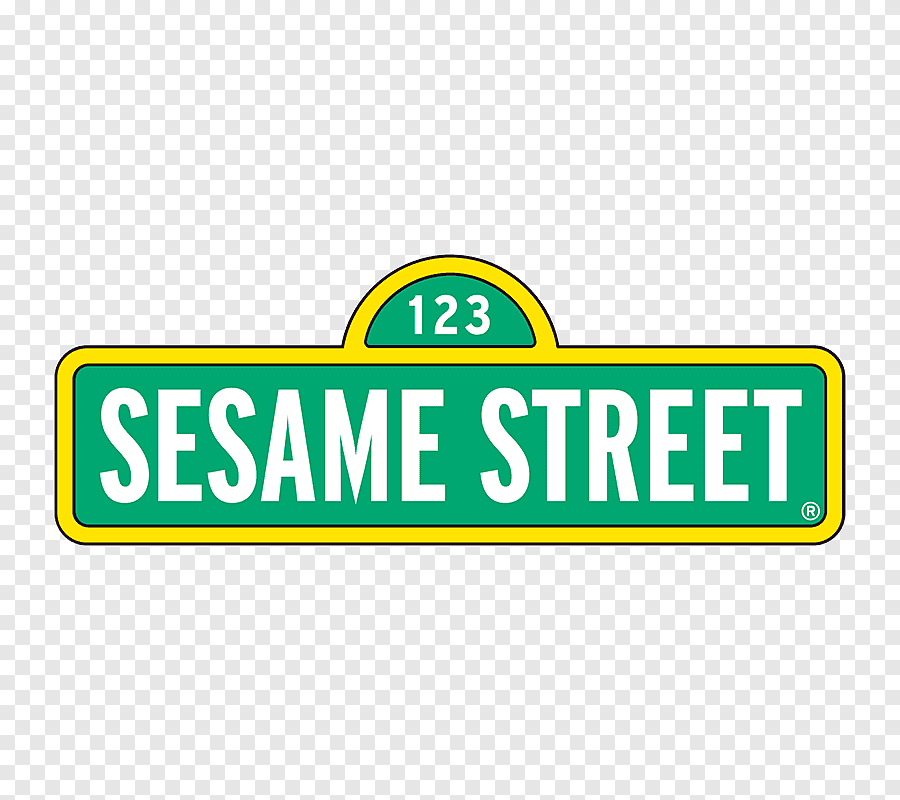
This is going to sound a little odd, but I think a lot about Elmo from Sesame Street. I follow him on Twitter, and every time one of his tweets comes across my feed, it’s like a ray of sunshine. It’s not hard to understand, I don’t think. Elmo is made of 50% fleece and 50% love.
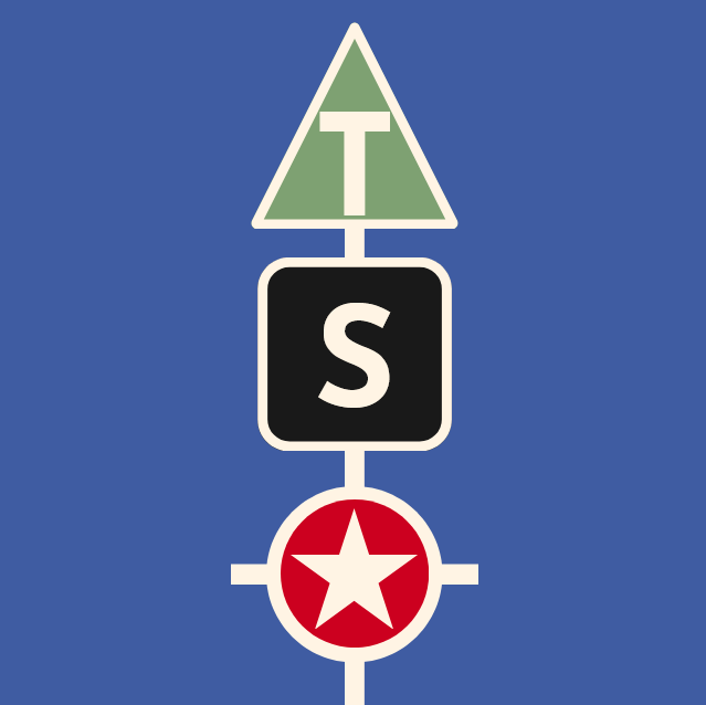
And because I think about Elmo fairly regularly, that means I have Sesame Street on my mind. And the Sesame Street logo is quite iconic. It’s simple, it’s big and bold, and it looks like what you’d expect… a street sign… huh. Also, Sesame Street is the most walkable neighborhood in America. When can I move in? The neighbors seem slightly crazy but fun.
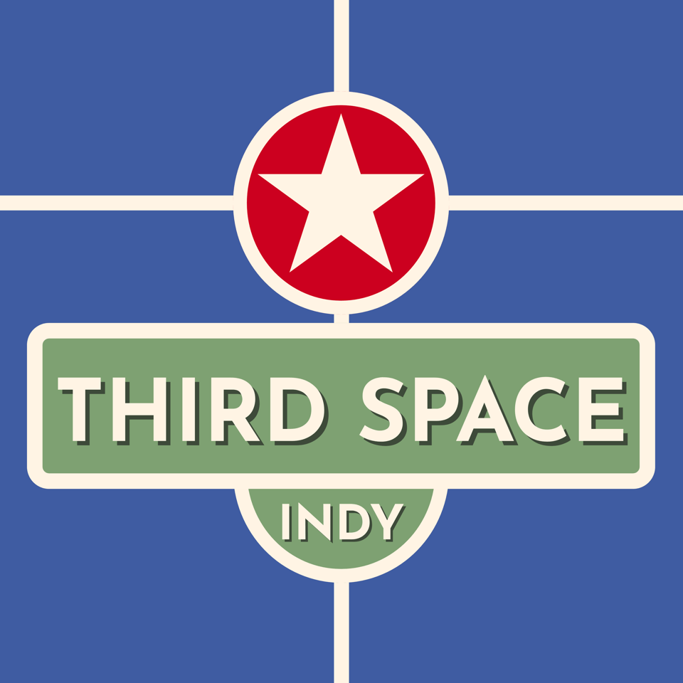
So, from this revelation, this iteration of the logo emerged almost immediately. I flipped the sign and increased the width of the half circle to be legally distinct. I shaded the words and removed the yellow in favor of the TSI cream color. The improvement was immediate and magical.
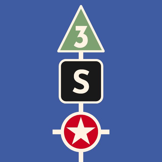
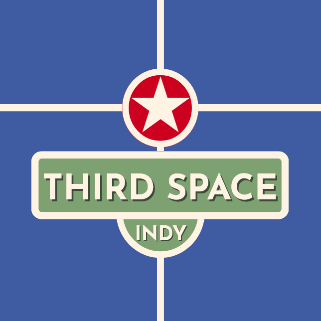
Love at Last Design
Let me describe to you what I see when I see this. The red circle and star from the Indy flag at the top are framed well on the bottom by the large green sign. This makes a box-like extension with your eyes that evokes the Indianapolis flag.
The lines of the flag extend to the edges of the square, implying they go on further away, but they also run through the green street sign, implying connectedness. Beyond this, the corners are rounded, safe, and could be sidewalks or roads.
The large green sign says both Sesame Street as a street sign, but also a city park. The shadowed letters are intentionally blackened and dark to imply the shade of trees. And then there in big bold capital letters are the words “Third Space Indy,” leaving nothing to chance, but also, in my opinion, welcoming looking. I love it.
On Instagram, I shared the logo, and honestly, it was the most messages I’ve received on there so far. I had only one dissenter, Maureen Forman, whom I am thankful for. They told me the lines on the first iteration of this final logo were too long-looking and I should consider shortening them. A perfect, succinct, and easy point of feedback. Instead, I just increased the size of everything else. This achieved the same thing while also more effectively filling out the “profile picture circle,” making for an easier read.
Overall, I’m really thankful for how I got to this point in the design. Thank you to anyone who offered their feedback or thoughts. I appreciate it greatly. And I absolutely look forward to sharing the next episode of Third Space Indy with you!
Third Space Indy is supported by Arrows.
Add a comment: